WorkFinyte
Finyte
The eight task lists I reviewed had 63 unfinished tasks on average. I designed Finyte to make the next week feel manageable.
- Project
- Finyte · Productivity
- Role
- Lead Product Designer
- Time
- 8 weeks
- Worked with
- One developer
- Planning window
- 7 days
- Each week to reassess tasks
- 1 review
- Tasks carried forward automatically
- 0
01
In brief
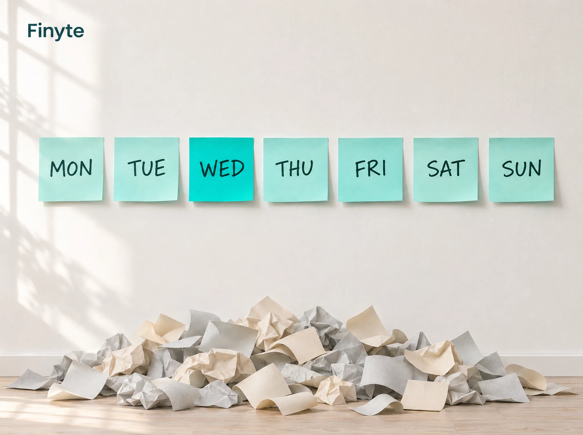
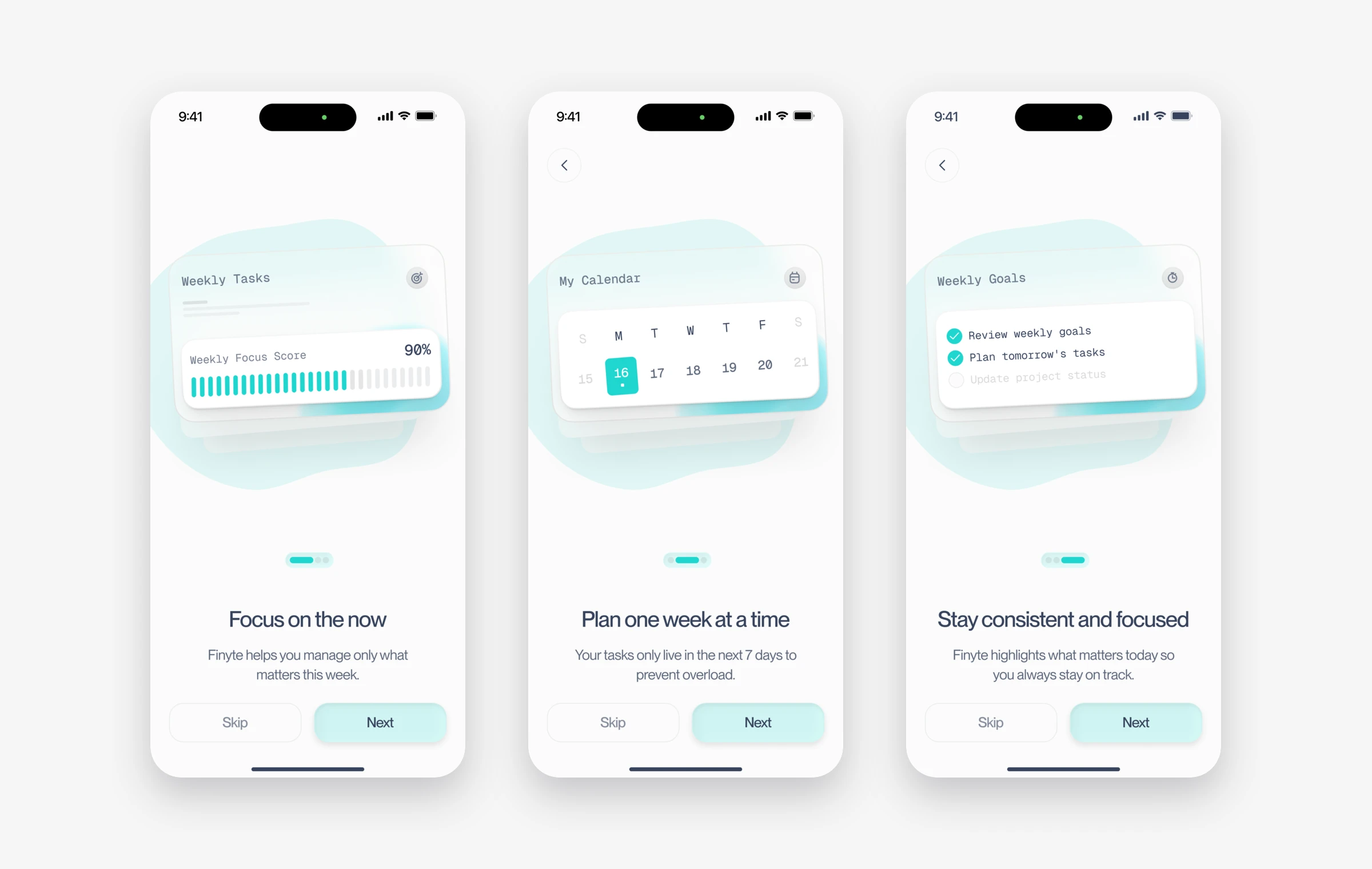
Finyte is a task app with one rule. You can only plan the next seven days.
I started it because of something I kept hearing from people around me: their to-do app made them feel bad. I asked eight of them to send me a screenshot of their list. The average was 63 open tasks, and the oldest task was five months old.
That became the starting point for a smaller planning window and a deliberate review of unfinished tasks.
02
Where it started
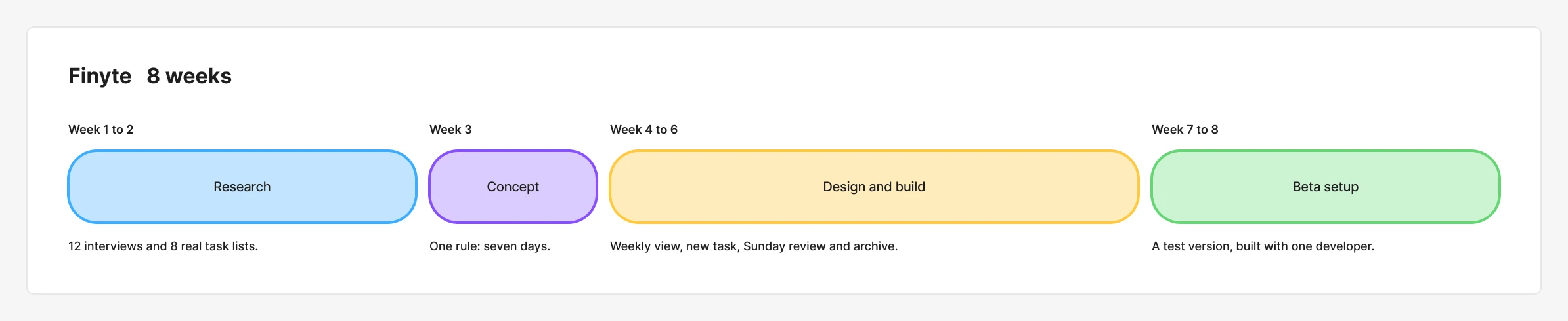
This was my own product idea. I led the interviews, user flows and interface design, and worked with one developer on a test version. We gave ourselves eight weeks for research, design, build and beta preparation.
Most task apps let you plan months ahead. The list gets longer, the old tasks sink to the bottom, and opening the app starts to feel like being told off. I wanted to find out what happens when the app refuses to hold more than a week.
03
Research
Twelve interviews and eight real lists
I interviewed 12 people who had dropped at least two productivity apps. Eight of them agreed to show me their real lists.
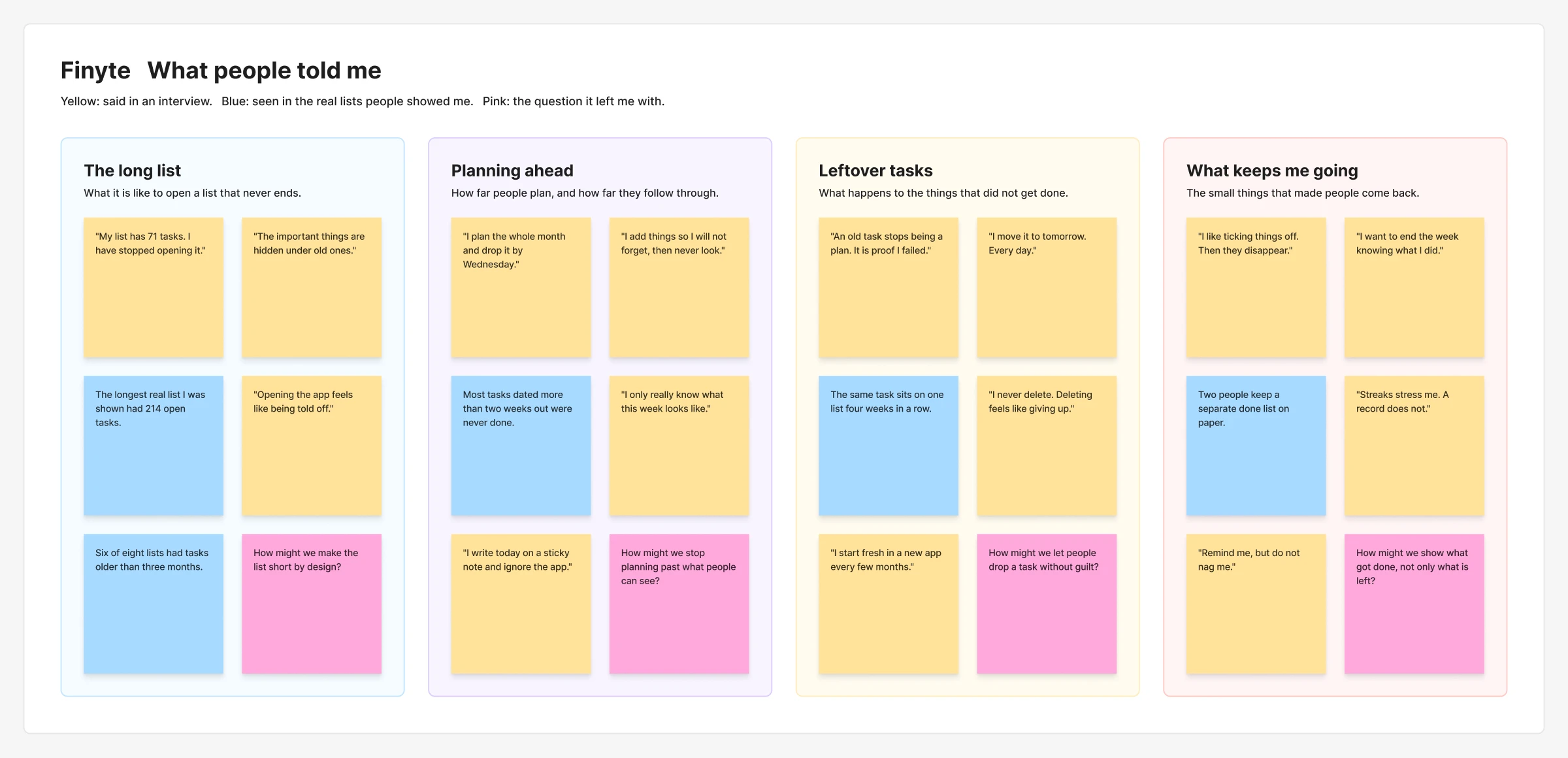
I expected to hear that the apps were too complicated. What I heard about was guilt. A task you added three weeks ago stops being a plan. It starts to feel like proof that you failed.

Who I designed for
Daniel works for three clients at once. He has tried five task apps in two years. His current list has 71 open tasks, and he has stopped opening it.
Wants
- To finish what he promised clients this week
- To end the week knowing what he got done
- To stop carrying old tasks around
What gets in the way
- A list so long that the important things are hidden
- Feels behind every time he opens the app
- Plans a whole month and abandons it by Wednesday
What they do today
- Writes today on a sticky note and ignores the app
- Adds tasks so he will not forget, then never looks again
- Starts fresh in a new app every few months
That changed what I was designing. A better way to organise a long list would not help Daniel. He needed a shorter list.
Three design decisions behind Finyte
04
1. I limited planning to seven days
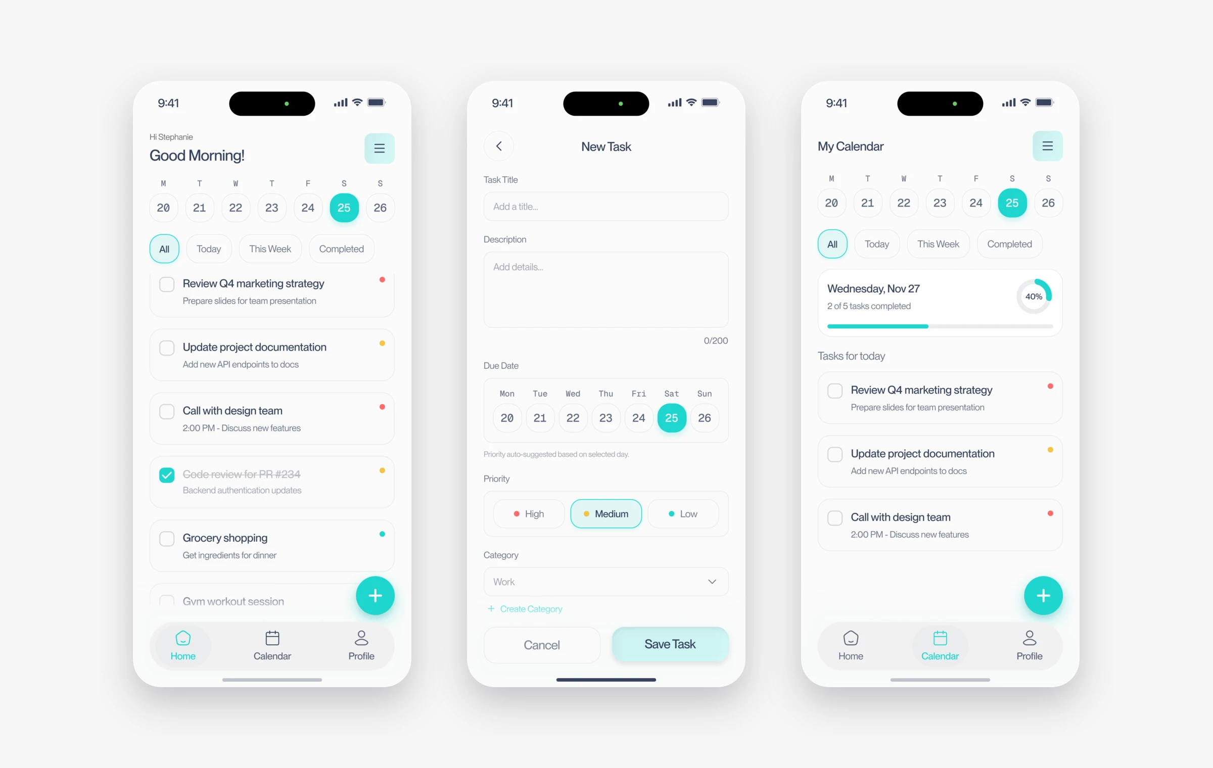
This is the whole product. You cannot add a task for next month, because next month does not exist in Finyte yet. When you add a task, the date picker only offers the next seven days.
The usual approach is to let people plan as far ahead as they like and help them sort it. The lists people shared showed the trade-off: more room to plan also made it easier to keep postponing tasks without reviewing them.
I gave up something real here. Finyte is the wrong tool for a six-month project plan, and I am fine with that. It is for this week.
05
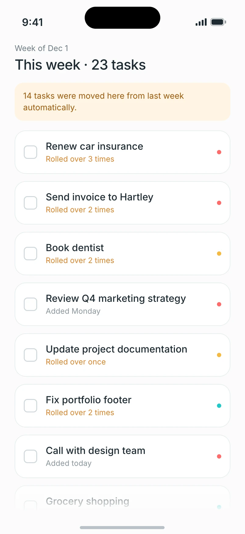
2. I let unfinished tasks roll over. The long list came back.
In my first version, anything you did not finish moved to the next week automatically. It felt like the kind thing to do.
I ran a two-week test with 15 people. By the end of the second week, six of them had the same task rolled over twice, and their week looked like the old list again. I had rebuilt the problem inside my own app.
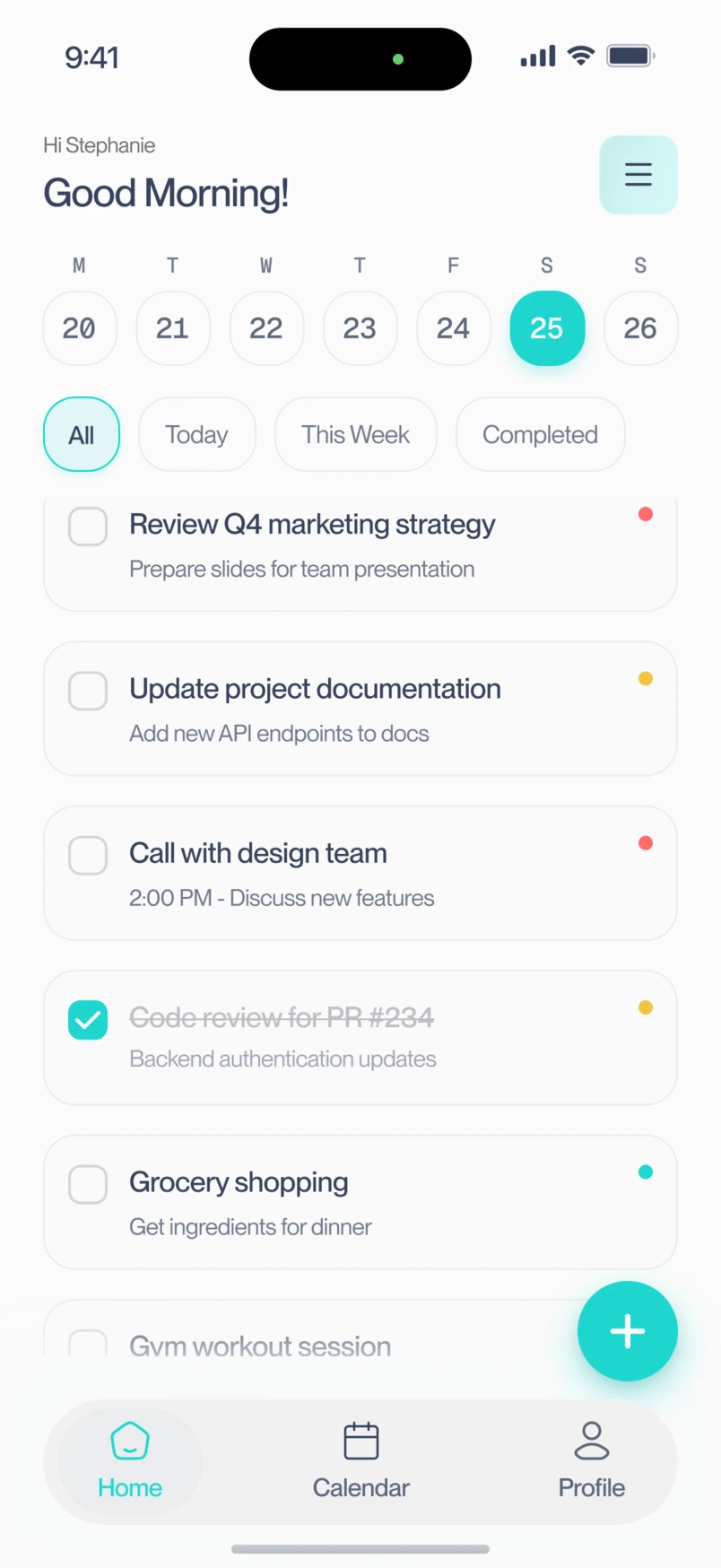
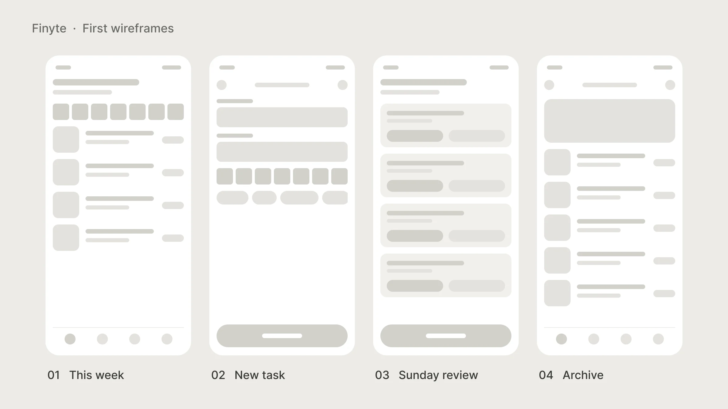
I replaced the rollover with a Sunday review. On Sunday evening, Finyte shows you each leftover task one at a time and asks you to keep it for the new week or let it go. Nothing moves by itself. A task you let go is stored in the archive, so you can bring it back.
The review made carrying a task forward a choice, rather than the default.
First version
Revised design
06
3. I kept finished tasks where you can see them
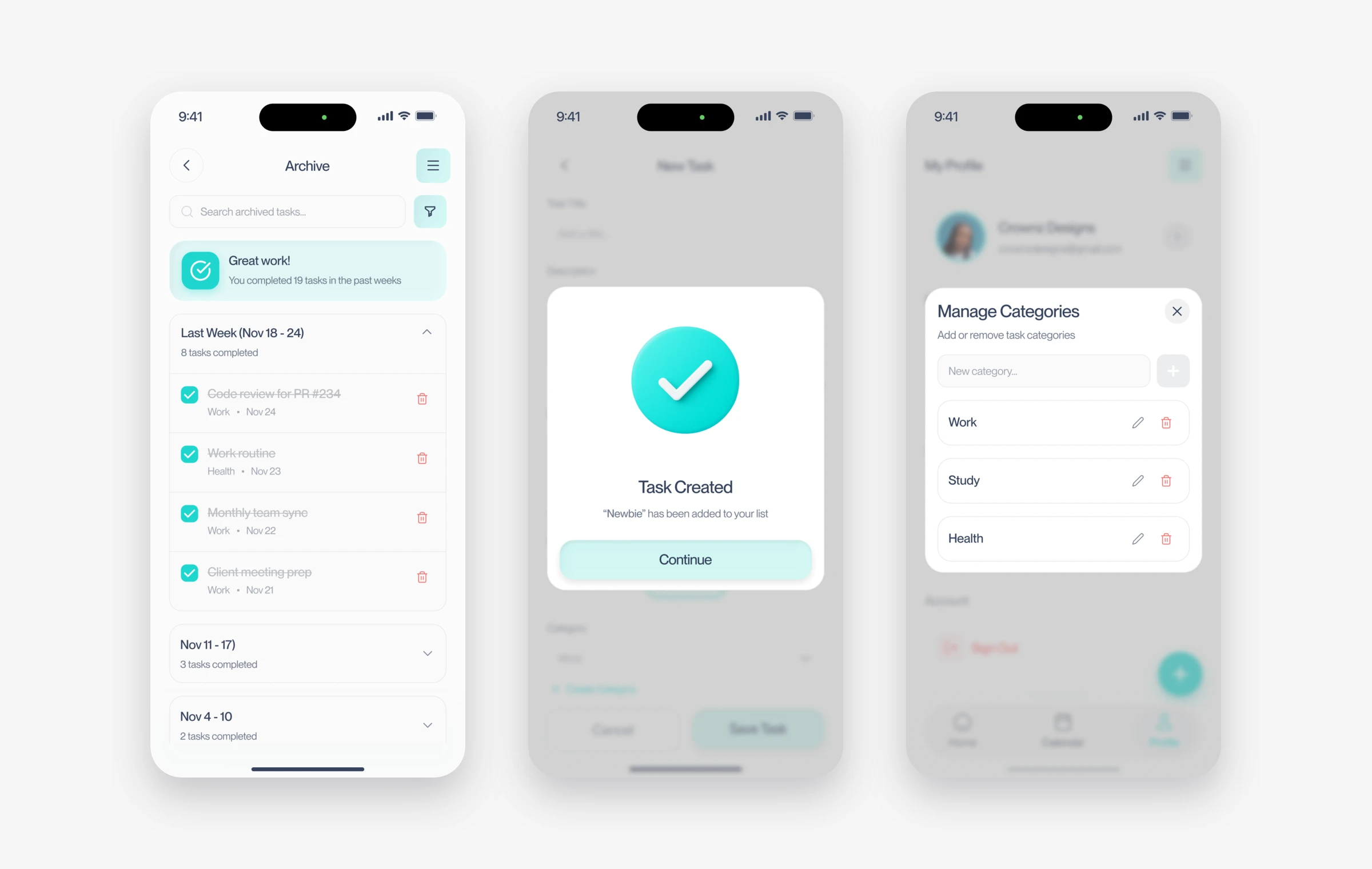
In most apps, a finished task disappears. The only thing left on the screen is what you have not done.
I added an archive that keeps completed tasks, grouped by week, so you can look back and see what you got through. It gives people a record of what they finished alongside what still needs their attention.
It is one more screen in an app that is supposed to have less, and I thought hard about that. I kept it because, in testing, this was the part people said kept them going.
07
What I designed
Plan the week, review what remains, see your progress
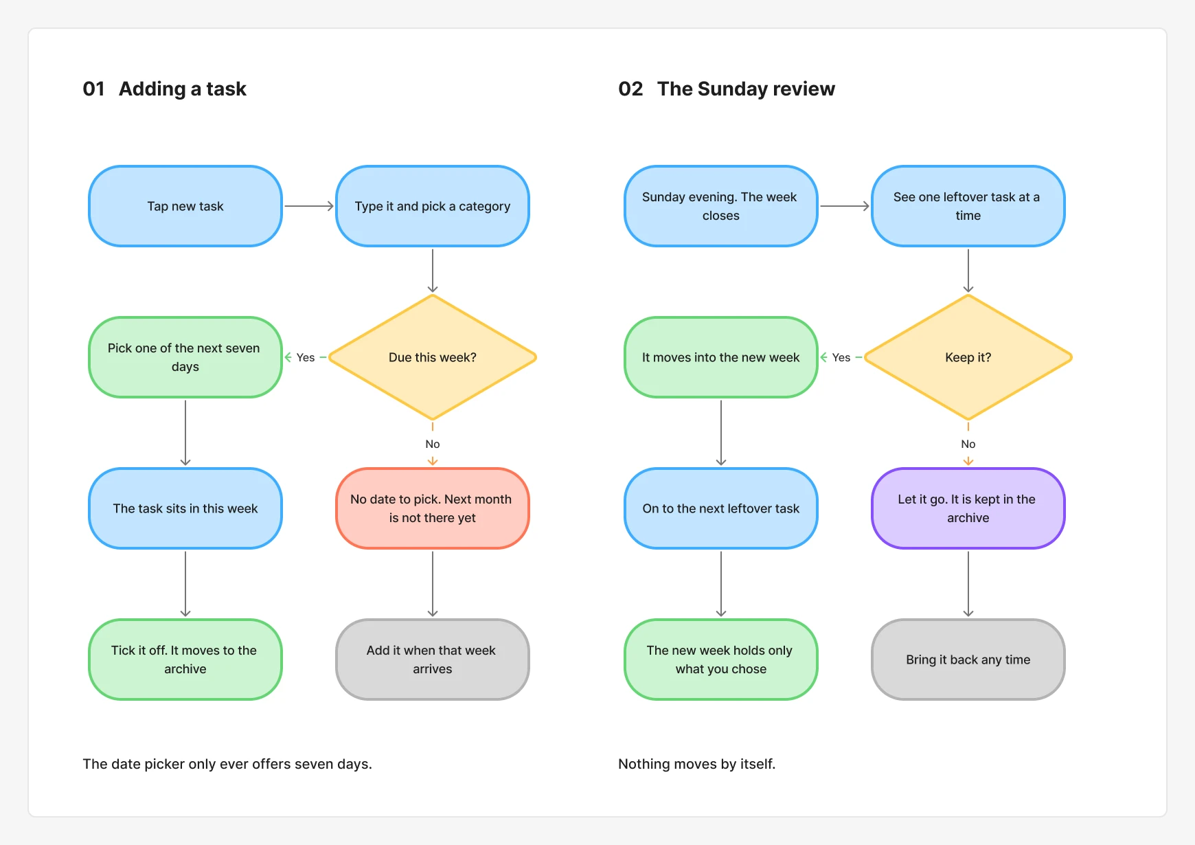
The weekly view keeps the current day visible with a subtle colour change. I left out red badges and loud notifications on purpose. The people I interviewed already felt pressure, and the app should not add to it.
08
What changed
A weekly plan with a deliberate reset
The final experience has a seven-day planning window and one weekly review. No unfinished task moves into the next week automatically. People choose what to carry forward, while the archive keeps completed work visible. The change is in how the app handles a backlog, rather than simply how it displays one.
I shaped the product concept, research and interface, and worked with a developer on the test version. The review flow was my response to a problem that the first version had recreated. Making that behaviour work consistently depended on the build as well as the screens.
Task completion also depends on workload, the size of each task and the time someone has available. A shorter list creates a different way to plan; it does not, by itself, prove that someone became more productive.
I would track completed tasks alongside continued use of the weekly review over a longer period. The question is whether people keep making realistic plans after the novelty of a new app wears off.
09
Looking back
Finyte taught me that a limit can be the feature. A shorter planning window gave participants a more manageable place to start. The next question is whether that approach supports a lasting planning habit.
The rollover was my mistake, and I am glad I tested it for two full weeks. In a one-hour session it would have looked fine. The problem only showed up when the second Monday came.
What I have not solved is the task that does not fit in seven days, like renewing a passport in three months. People asked about it, and I do not have a good answer yet.
Next project · Mobile game