WorkTandem
Tandem
People were opening shared accounts and never using them. The approval screen did not give them enough clarity to act.
- Project
- Tandem · Fintech
- Role
- Lead Product Designer
- Time
- 12 weeks
- Worked with
- The founder and three engineers
- Mobile experience designed
- 14 flows
- Add an approver
- 3 ways
- Access technical details
- 1 tap

01
In brief
Tandem is a wallet for money that belongs to more than one person. A family, a small team or a savings group keeps money in a shared account, and a payment only goes out when enough of them approve it.
Tandem already had this on the web. People liked the idea and opened shared accounts, but most of them made one payment and never came back. I was brought in to design the mobile app and fix the approval experience.
I redesigned account setup and payment approvals as one connected mobile experience, working with the founder and engineers to make the group’s next steps visible.
02
Where it started
The web wallet had been live for about a year. The team’s data showed two problems. People abandoned shared-account setup, and payment requests expired before enough members approved them.
The founder’s view was that people needed more education on how shared accounts work. I asked for two weeks to find out before I designed anything.
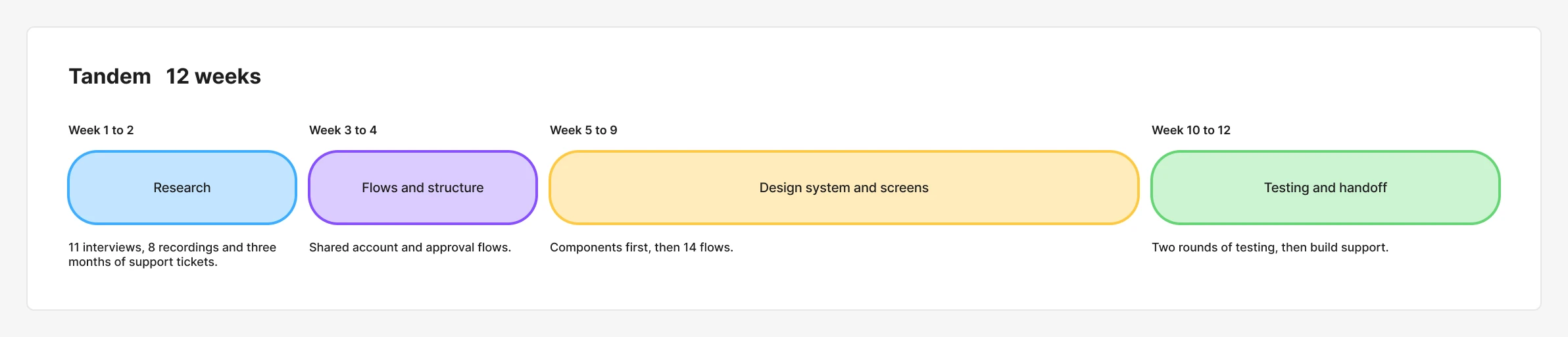
I led the research, approval flows and mobile interface, working with the founder and three engineers. We had twelve weeks to make account setup easier to complete and payment requests easier to review.
03
Research
Eleven interviews, eight recordings and the support inbox
I interviewed 11 people who share money with others: couples, small teams and two savings groups. I also watched eight recorded sessions of people using the web wallet, and read three months of support tickets.
Nobody was confused about the idea. They understood that a payment needed approval from the group before money could move. What stopped them was the approval screen. It showed a contract address, a function name and a long code. People were being asked to approve real money on a screen they could not read.
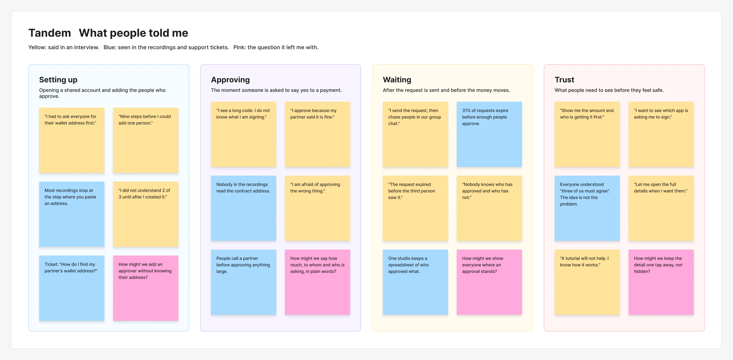
I designed for both sides of an approval: the person asking, and the person being asked.

Who I designed for
Amara pays contractors in three countries from a shared studio account. Two partners must approve every payment. She is comfortable with digital dollars but she is not technical.
Wants
- To pay contractors on the day she promised
- To know that no payment leaves without two partners agreeing
- To check a request in seconds, from her phone
What gets in the way
- Approval screens full of codes she cannot read
- Has to message her partners to remind them to approve
- Requests expire and she starts again
What they do today
- Sends a request, then chases people in the studio group chat
- Calls a partner to confirm before she approves anything large
- Keeps a spreadsheet of who approved what

And who she is waiting on
Leo is one of three people who must approve every payout from his savings group. He takes the job seriously, which is why he is slow. He would rather miss a request than approve the wrong one.
Wants
- To be sure what he is approving before he taps
- To see who else has already approved
- To say no in a way the group can see
What gets in the way
- Gets a notification that says only that a request is waiting
- Cannot tell a real request from a fake one
- Is blamed when a request expires
What they do today
- Leaves requests until the evening, when he can sit down
- Asks the requester to send a screenshot first
- Ignores anything that shows a code and no name
The interviews and recordings pointed to a lack of confidence at the moment of approval. Explaining shared accounts would not answer the questions people had about a specific payment. The founder agreed after watching two of the recordings with me.
Three design decisions behind Tandem
04
1. I made approvals simple. People trusted them less.
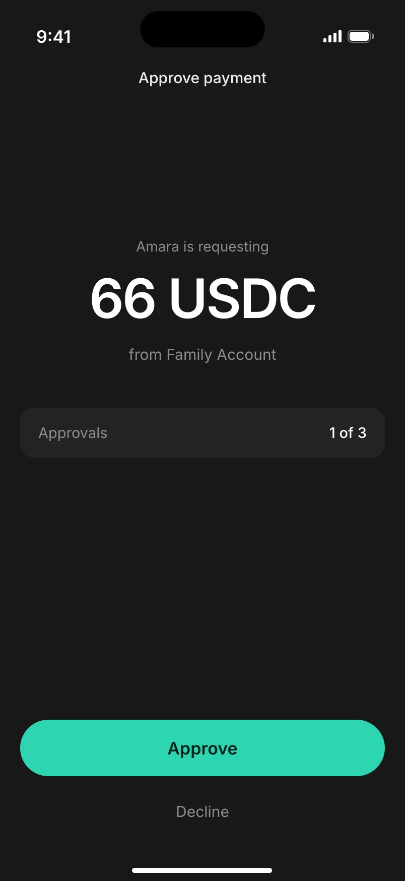
My first design went all the way in the other direction. One screen, the amount, and a large Approve button. I hid the technical details completely.
I tested it with ten people and seven said they would not approve. One of them explained it better than I could: “If you are hiding it, I assume it is bad.” By removing the detail, I had removed their reason to trust the screen.
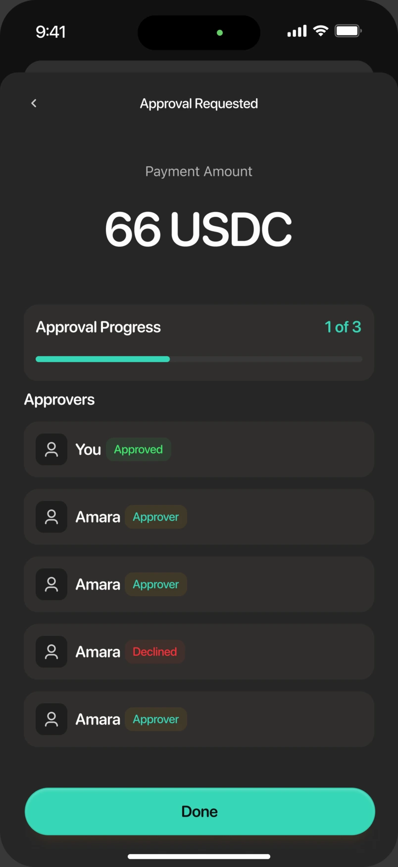
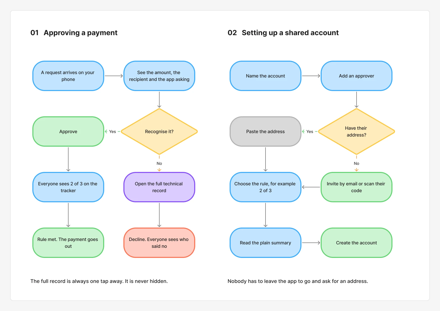
The version that worked sits in the middle. The top of the screen answers three questions in plain words: how much, to whom, and which app is asking. The full technical record is one tap below for anyone who wants it. Keeping the requesting app visible gives people more context to check before they approve.
First version
Revised design
With money, people want to see enough to feel safe. My job was to decide the order.
05
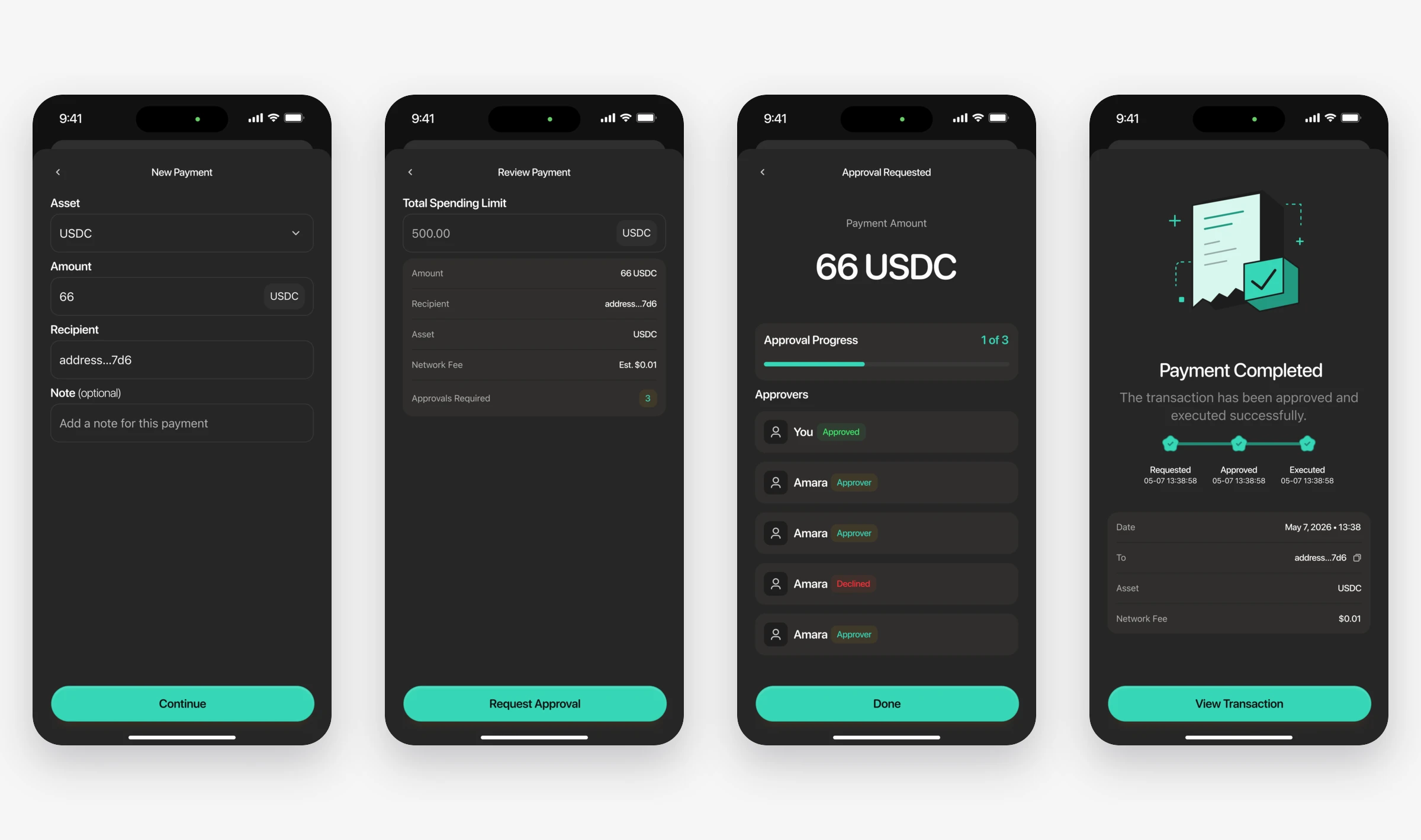
2. I showed everyone where an approval stood
On the web, after you asked for a payment, you saw the word “Pending” and nothing else. So people left the app and chased each other in group chats.
I added an approval tracker that every member can see. It shows how many approvals are still needed, who has approved, who has declined and who has not opened the request. Each approver gets one notification with the amount and the name of the person asking.
The engineers were not sure about showing who declined. They worried it would cause arguments. We tested both versions, and people preferred to know. A silent “no” was causing more trouble than a visible one.
06
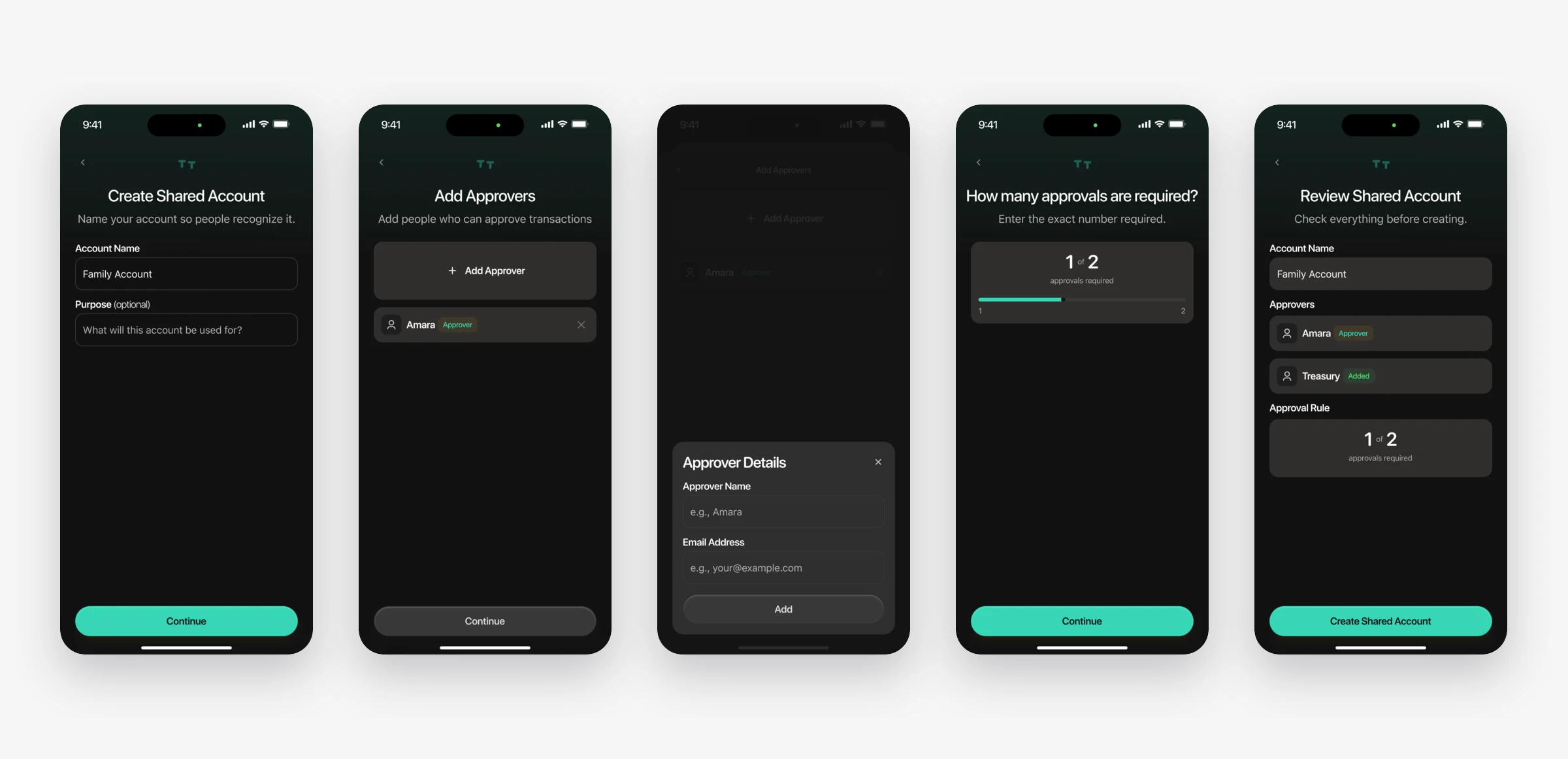
3. I let people add approvers without a wallet address
Setting up a shared account took nine steps on the web. The hardest one came early: paste the wallet address of every approver. Most people do not know their partner’s wallet address. They left to go and ask for it, and did not come back.
On mobile, you add an approver by email invite or by scanning their code. You can still paste an address if you have it. Then you choose how many members must approve each payment and review a plain-language summary before creating the account. The approval rule stays visible, so members know how decisions will be made.
07
What I designed
Components first, then 14 flows
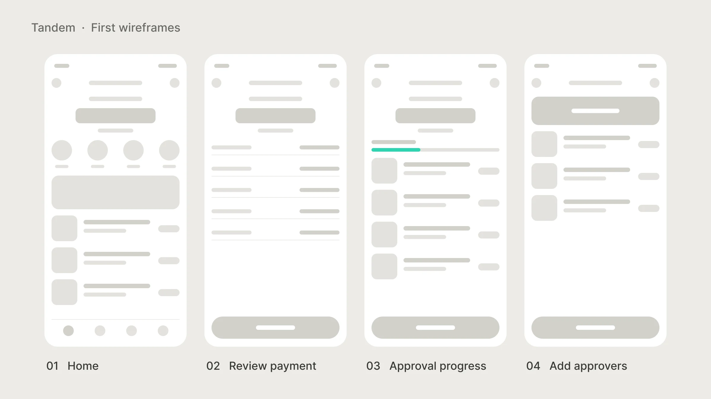
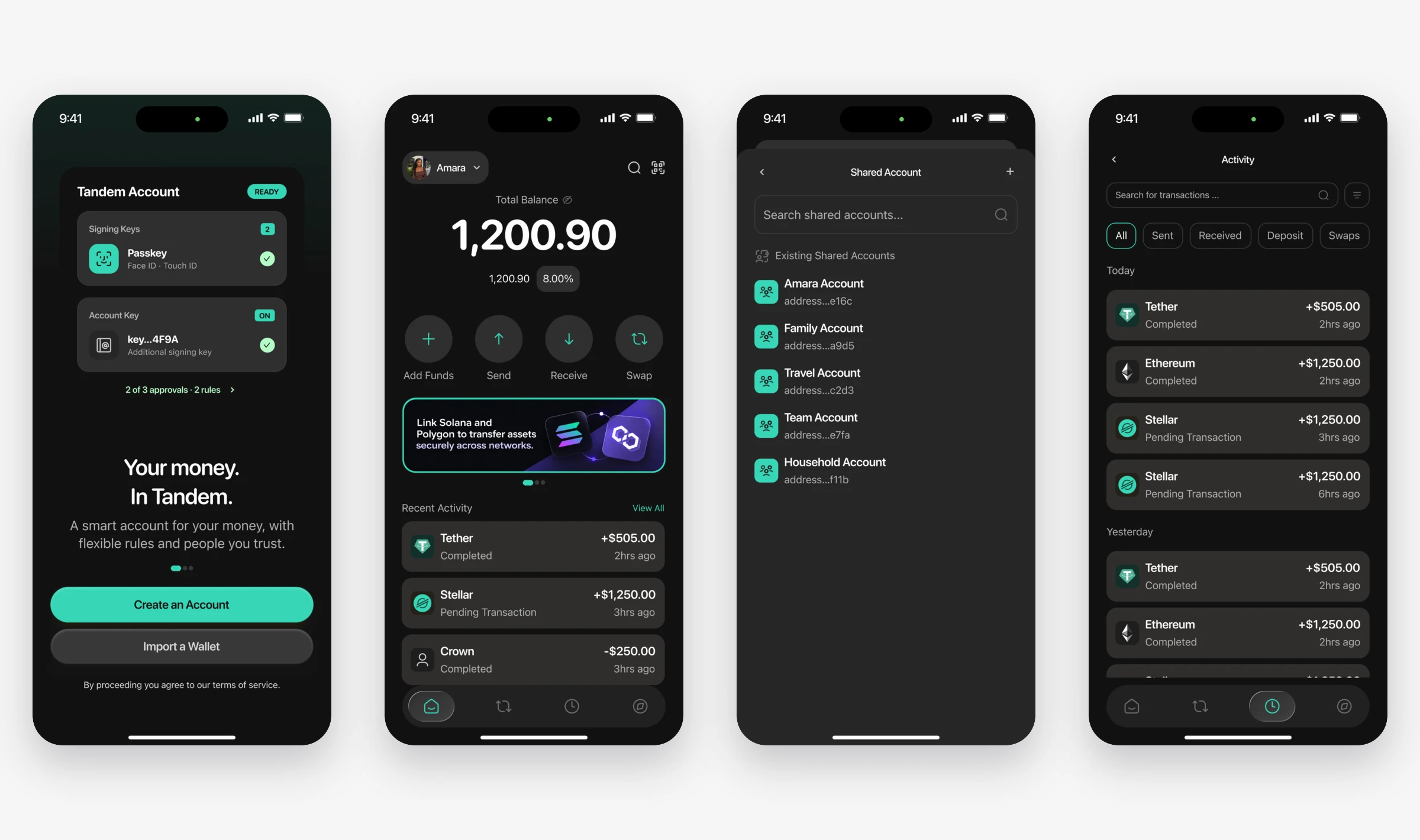
The engineers were building in React Native and needed every state of every screen. So I designed the components first: buttons, cards, inputs, and the loading, success and error states needed across the flows. The 14 flows were assembled from those parts, including onboarding, sending, receiving, shared accounts and signing.
08
What changed
A payment the group can review together
I designed 14 connected mobile flows from a shared set of components. Within account setup, people can add approvers by email, by scanning a code or by entering a wallet address. The approval screen leads with the payment context and keeps the technical record one tap away.
I led the research and design decisions behind that change. The founder helped shape the product direction, and the engineers turned the flows and interface states into the mobile experience. My part was making the information and decisions clear enough to act on.
Approval speed also depends on notification delivery, app reliability and when other members are available. Moving from the web to mobile changes access as well as the interface, so any improvement would reflect the combined work.
I would assess the release through setup completion, time to full approval and requests that expire. Those measures need to be read together: faster approvals only help if people still understand what they are approving.
09
Looking back
Tandem taught me that simple and trustworthy are two different things. My cleanest design was the one people trusted least.
I would bring the engineers into testing sooner. The argument about showing declines took us a week. It ended in ten minutes once they sat in on two sessions.
The next thing I would look at is payments that repeat, like rent or salaries. Right now the group reviews the same payment every month. I would explore whether recurring approvals could reduce that repetition while keeping the amount, timing and ability to cancel clear to every member.
Next project · Productivity