WorkVeya
Veya
People were saving events and staying at home. Research pointed to a different problem: walking in alone.
- Project
- Veya · Social discovery
- Role
- Lead Product Designer
- Time
- 10 weeks
- Worked with
- The founder and two engineers
- Onboarding questions
- 14 → 5
- People per group
- 3–5
- Focus of each group chat
- 1 event
01
In brief
Veya is an app for people who want to go out but do not want to go alone. It matches you to an event, and to a small group of people, before you get there.
The founder came to me with a clear request: make the event recommendations better. Two weeks into research, the stronger problem was what happened after someone found an event. People were already finding events they liked. They were saving them and then staying at home.
I redesigned the journey around meeting a small group before the event, so people had someone to look for when they arrived.
02
Where it started
The first version of Veya was an event feed. About 400 people had signed up from a waitlist, and the early numbers looked healthy. People opened the app and saved events.
Then the organisers shared their door counts. Saving an event was not translating reliably into attendance. The founder believed the feed was showing people the wrong events, and asked me to fix the matching.
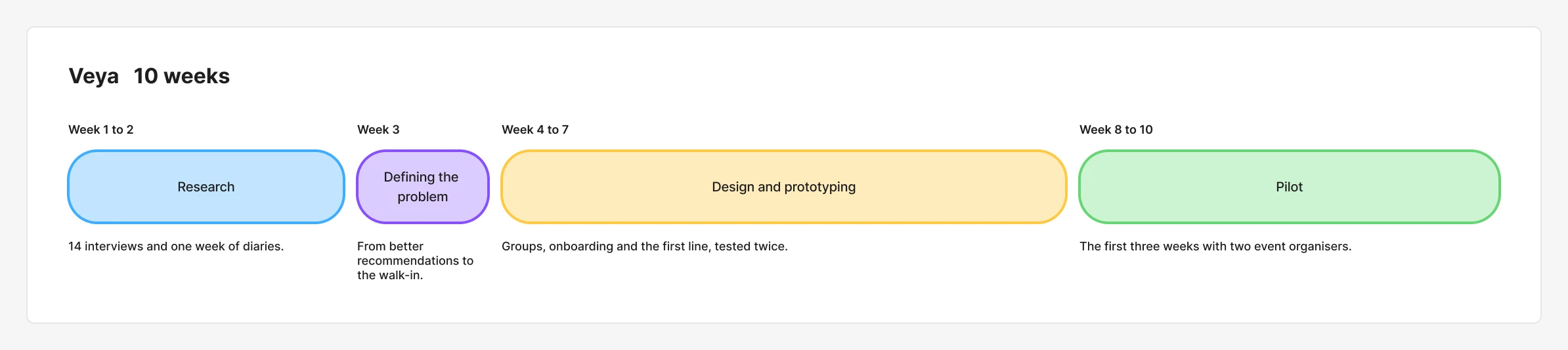
I was the only designer, working with the founder and two engineers across research, user flows and the interface. We had ten weeks to design and begin testing a journey that helped people move from saving an event to attending it.
03
Research
Fourteen interviews and one week of diaries
I interviewed 14 people who had saved at least three events and attended none of them. Then I asked six of them to keep a short diary for a week. Every time they thought about going out, they wrote down what they did next.
I expected complaints about the events. I got almost none. What kept coming up was the door. People described getting dressed, travelling there, and turning back because they did not know anyone inside.
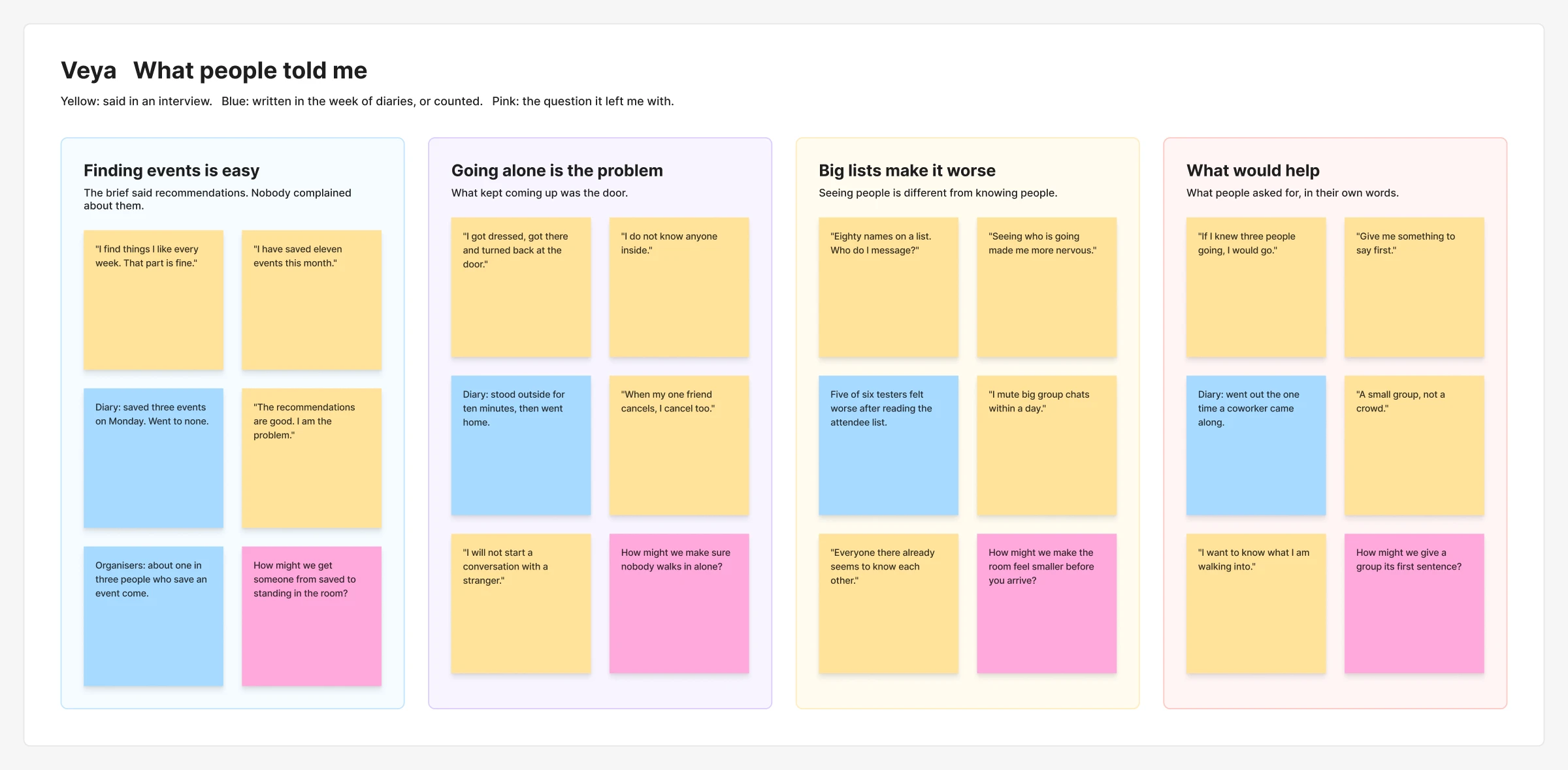
Two patterns shaped the personas below: people who struggled to arrive alone, and people who attended but struggled to start a conversation.
Who I designed for
Maya moved for work eight months ago. Her friends are in another city. She follows event pages, saves things every week and has attended one event since she arrived.
Wants
- To meet a few people she actually likes
- To go out without planning it for days
- To know what she is walking into
What gets in the way
- Arrives, sees a room of strangers and leaves
- Cancels when the one friend she invited cancels
- Will not start a conversation with someone she does not know
What they do today
- Saves three or four events a week
- Asks one work friend, then gives up
- Mutes big group chats within a day
A different barrier to connection
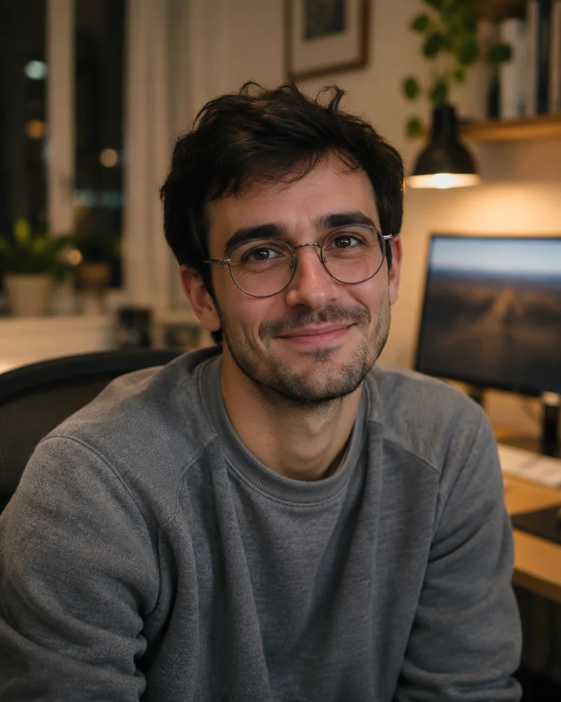
Dev has lived in the city for six years and still goes out less than Maya. He does turn up to things. He stands near the wall for twenty minutes, talks to nobody and leaves.
Wants
- To have one real conversation, not ten short ones
- To know who he is looking for before he arrives
- To leave feeling it was worth the trip
What gets in the way
- Does not know how to join a circle of people already talking
- Big groups drain him within the hour
- Feels worse after an event than before it
What they do today
- Arrives late so that the room is already busy
- Stays on his phone near the door
- Books events and decides on the day
I took the diaries back to the founder. We agreed to stop working on recommendations and help people feel comfortable arriving.
Three design decisions behind Veya
04
1. I showed people who was going. It made things worse.
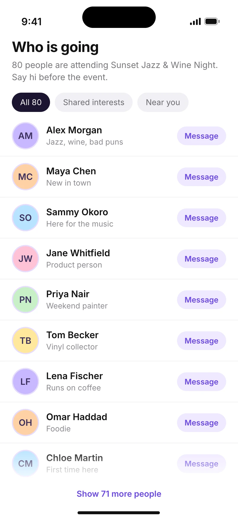
My first idea was the obvious one. If people are nervous because they do not know anyone, show them who is coming. I designed an attendee list for every event, with photos and short bios.
I tested it with six people and it failed. Five of them said the list made them more nervous. One event had 80 people on it. The list showed who was attending, but still left people to start a conversation with a stranger.
Seeing people was different from knowing people. So I removed the list and designed small groups. Before an event, Veya puts you with three to five people who are going to the same thing and share something with you.
First version
Revised design
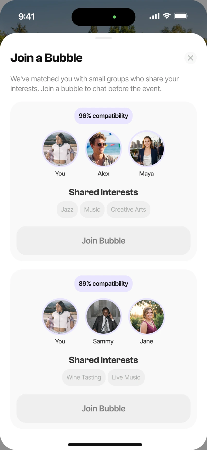
You arrive knowing who to look for, because the conversation has already started.
05
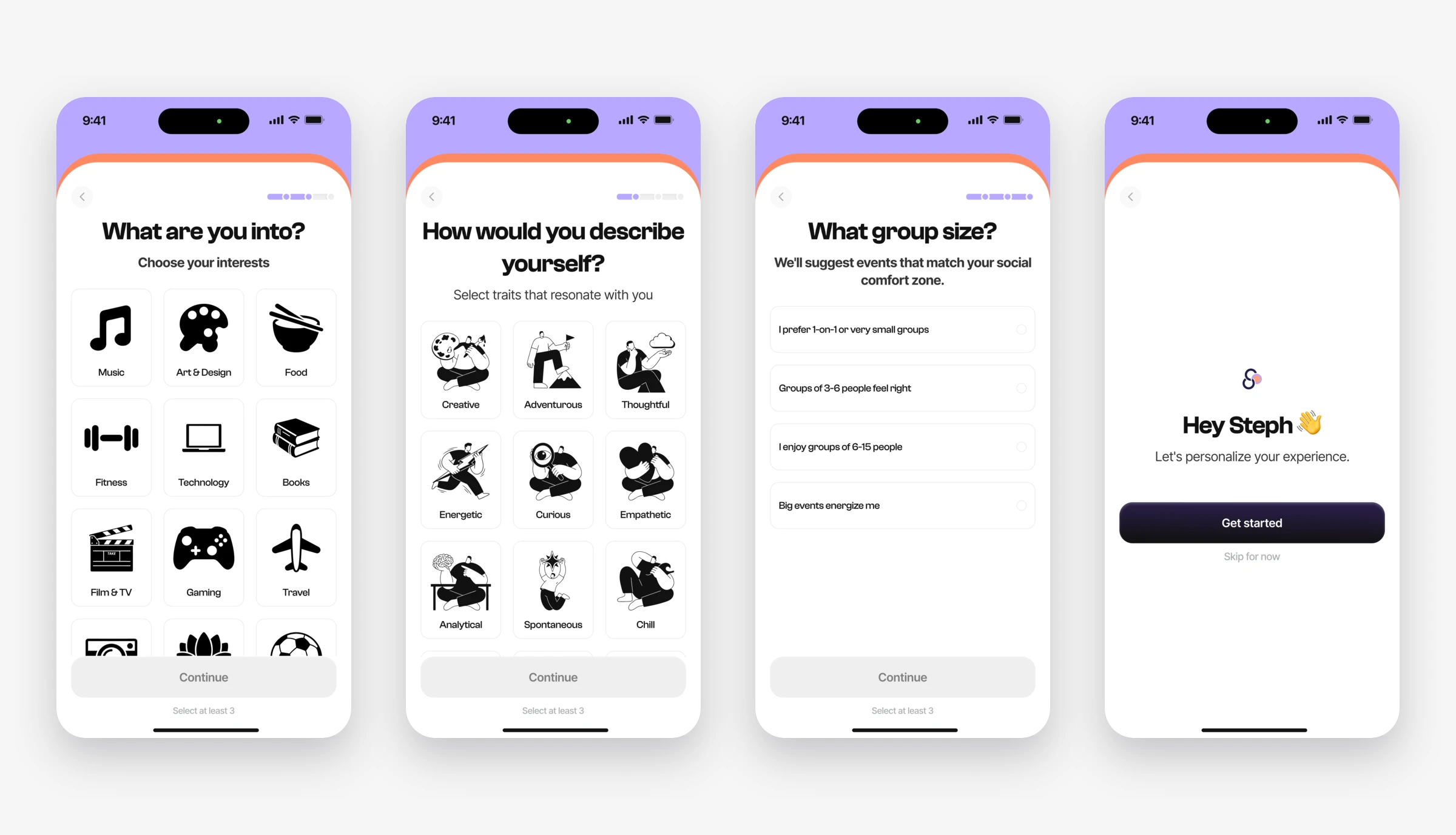
2. I cut onboarding from fourteen questions to five
Groups only work if Veya knows a little about you. My first onboarding was a 14-question quiz. It asked for a lot of information before people could explore an event.
That made sense when I thought about who was using it. These were people already nervous about going out. The form asked for too much effort before showing how the app could help.
I cut it to five quick questions about interests, social preferences and comfortable group sizes. The shorter flow keeps the questions focused on forming a suitable group. Group size became an important input to matching. Someone who picks three people is never shown a group of five.
06
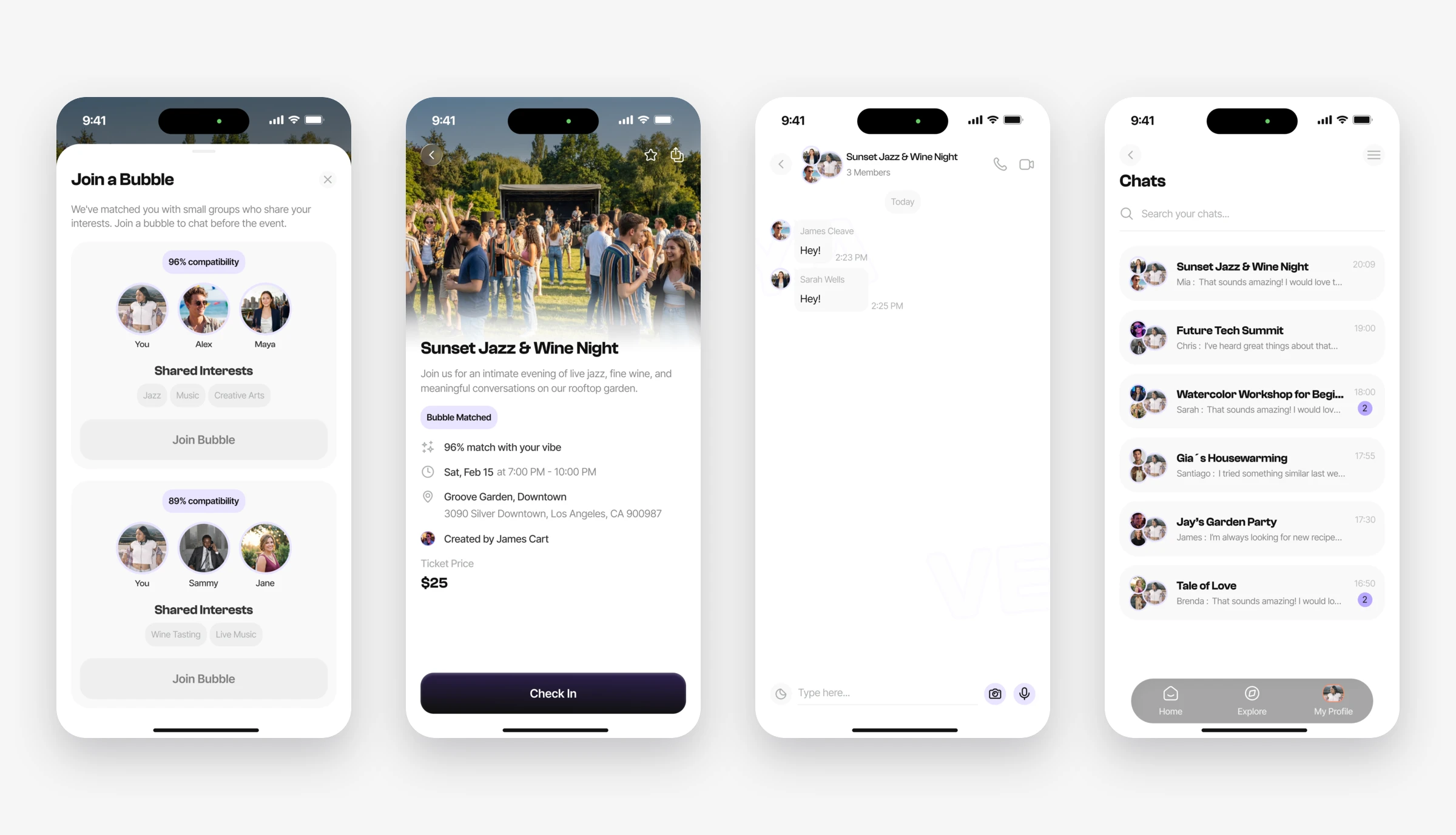
3. I gave people a first line to say
Even in a group of four, the chat stayed quiet in the first test. People joined and waited for someone else to speak.
I had been showing a short bio for each member. I replaced the bios with what the group has in common, and the chat now opens with a question built from it. For example: “Three of you picked live jazz. Has anyone been to this venue before?”
In the second round of testing, all three groups started talking without me asking them to.
07
What I designed
One path, five parts
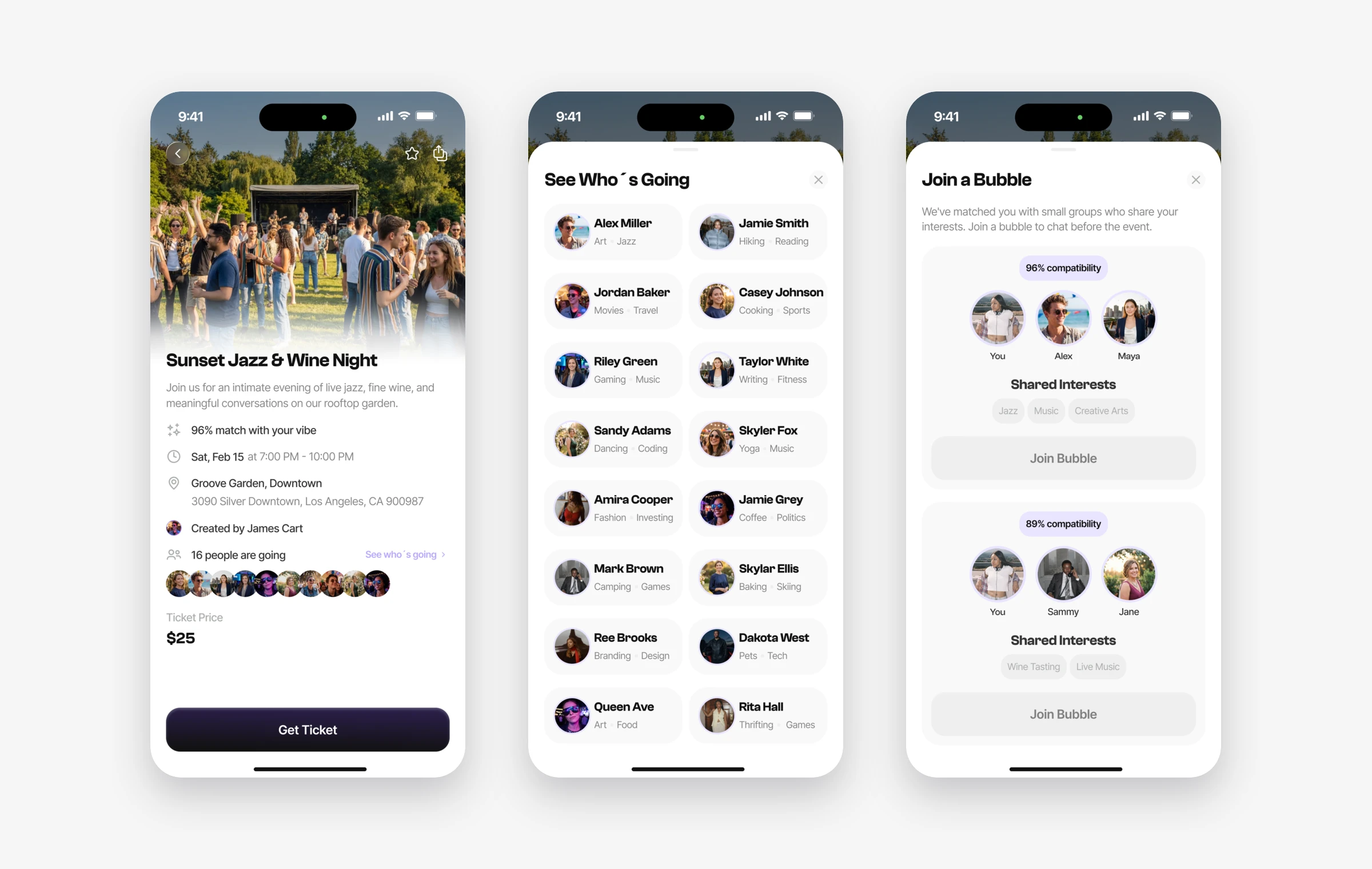
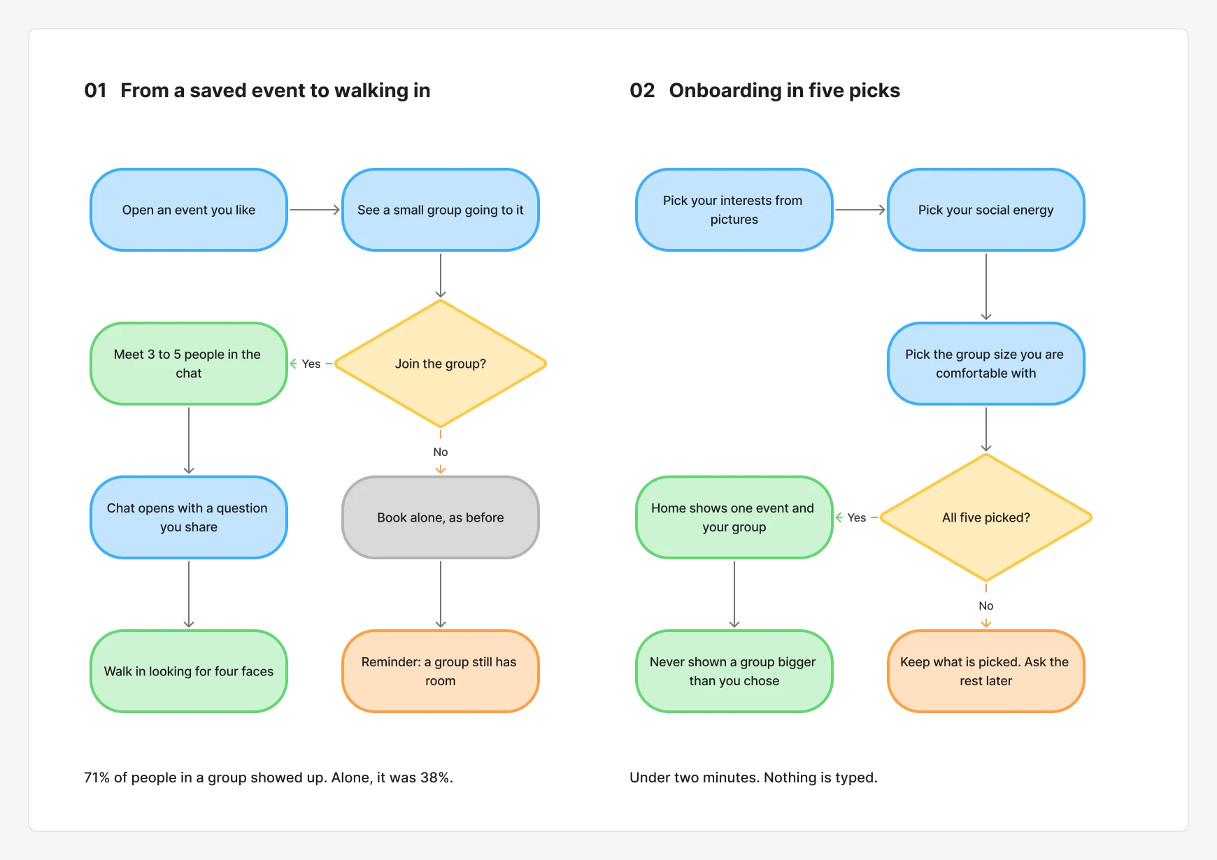
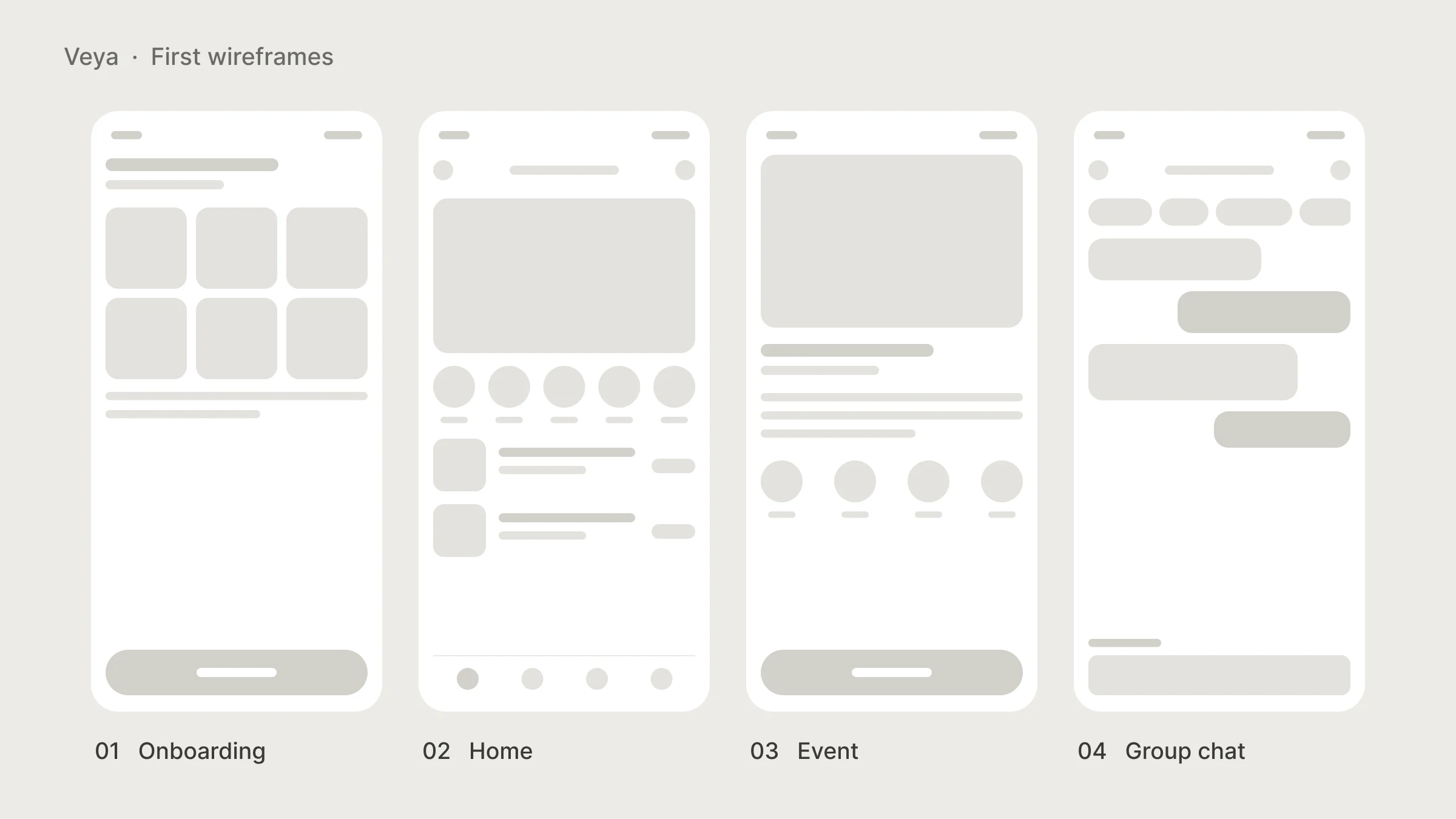
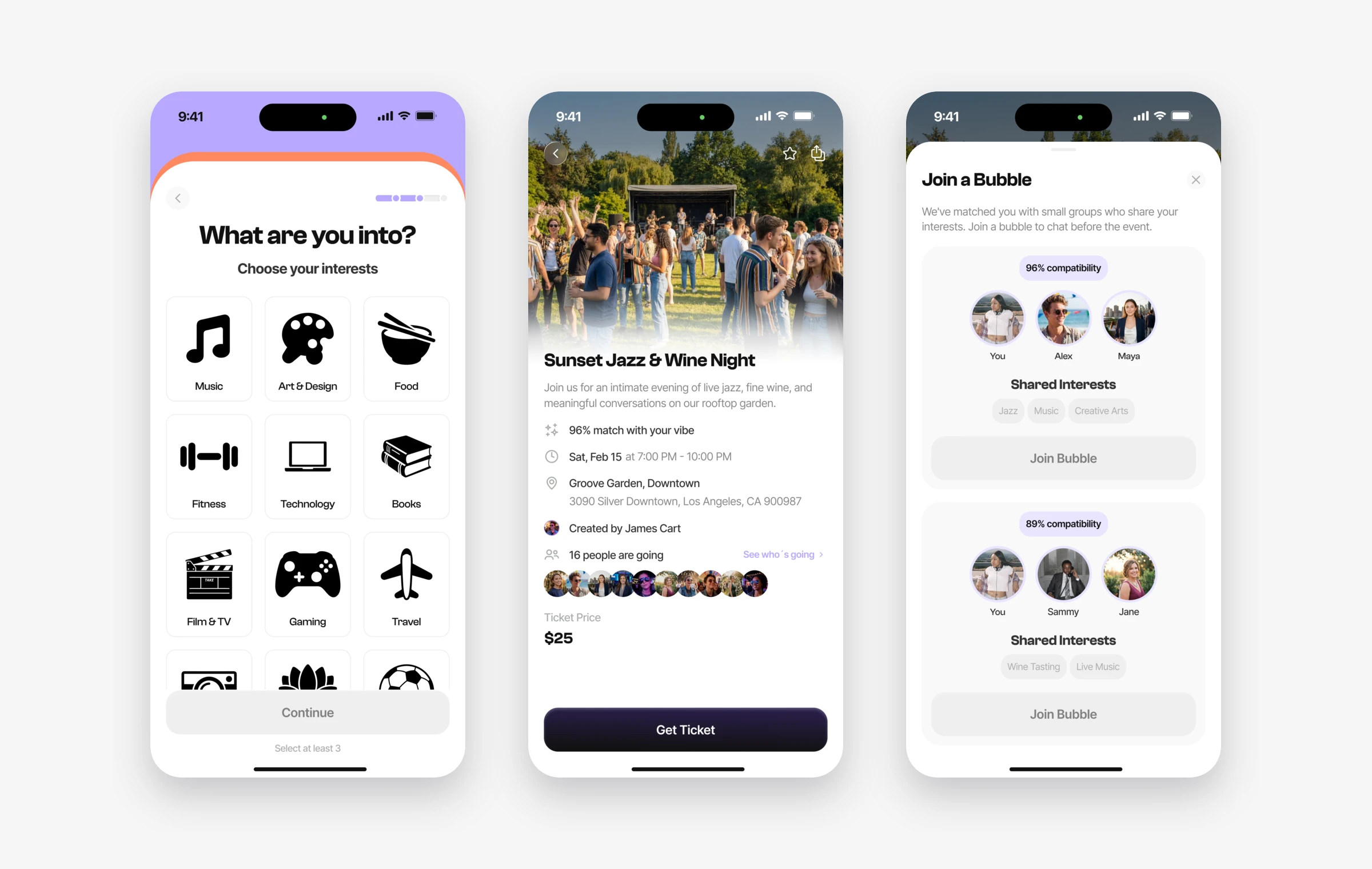
The app follows one path. You tell Veya about yourself, pick an event, meet your group, talk, and go.
08
What changed
Meeting people before arriving
I cut onboarding from 14 questions to 5 and replaced the long attendee list with groups of three to five people. Each chat belongs to one event, giving the group a shared reason to start talking. Those changes moved the experience beyond saving an event to preparing to attend it.
My contribution was identifying that gap and turning it into onboarding, group matching and chat flows. I worked with the founder and engineers to make those parts fit into one journey.
That journey addresses one barrier to attendance. It does not remove the others. Timing, travel, cost, the event itself and how organisers welcome people can all affect whether someone shows up. Joining a group is not the same as attending an event.
The next thing I would measure is the path from joining a group to attending, then returning for another event. That would help the team understand where the experience helps and where people still drop off.
09
Looking back
The main thing I took from Veya is to check the problem before I solve it. If I had done what the brief asked, I would have improved event discovery while leaving the main barrier to attendance untouched.
The attendee list taught me something too. Everyone on the team liked that idea, including me, and six test sessions showed why it needed to change. I now test the obvious idea first, before investing in a full design.
If I continued, I would follow people past their second event. Meeting a group beforehand is only the start. I want to know if those people become friends, because that is what would keep someone on Veya for a year.
Next project · Fintech